The most important reason for having some kind of shell structure across the University is for the sake of the students. Students often report experiencing high levels of inconsistency across their online topic sites, which means learning the navigation and structure for each online topic site uniquely. As a result, the number one request from students when asked for feedback about FLO is to improve the consistency of online topic sites, not in teaching approach or pedagogy, rather consistency of layout and structure.
So, the purpose of the shell is firstly, to provide some consistency, we know this reduces the students’ cognitive load, which has a positive impact on their learning.
Secondly, to ensure that certain important elements that benefit students are present in each topic and can always be found in the same place.
Does the shell allow for variation?
Yes, we do recognise that the huge variety of topics taught at Flinders will require quite a lot of latitude in how topics are presented in Canvas. We have consulted with academic staff across the University, and as a result the new shell is very minimalist, and can accommodate a wide range of uses, structures and additions, if its essential components are kept intact.
Why has it changed?
As we first transitioned from Moodle to Canvas, many topics were still being taught in Moodle and many staff and students were using both platforms, so it made sense to stick to the existing shell. This will no longer be the case next semester and we have now had time to get used to Canvas and how it differs from Moodle. So, the time is right for updating the shell to make better use of those differences.
The old structure
The original shell was designed for Moodle and consisted of an initial welcome area and a series of modules. The first three modules being:
· Topic information and resources
· Communication hub
· Assessment hub
These modules were followed by a series of fourteen unstructured modules for weekly topic content.
The first three modules had a structured layout and contained Moodle tools and other items. They were designed to group important functionality and information that may otherwise be left out of the topic or hard to find. Due to the structure and functionality of Canvas they are now largely redundant. Much of their function is replaced by items in the Canvas topic navigation menu, the rest is in the new “Finding your way module”.
The new structure
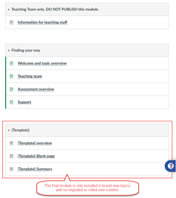
The new Canvas shell consists of three modules, each with one or more pages, they will appear at the top of the Modules area of your topic as shown in Figure1.
 Figure 1
Module 1
Module 1 contains information for the teaching team. It contains some explanation of how you can interact with the new shell, but you can add whatever other content you think will be useful. It should always remain hidden from students.
Module 2
Module 2, Finding your way, is designed to replace the initial welcome area, the Topic information and resources module and Assessment module from the old shell. The information they contained is mostly held elsewhere in Canvas and the remainder can be transferred into the relevant pages of module 2.
It contains four pages:
- Welcome & Topic Overview page.
This page is also the home page for the topic. It is a place to welcome your students, orient them to the topic and direct them on their next steps. - Teaching Team page
A place where students can find your teaching team details. A suggested structure is included on the page. - Assessment overview page
This page is pre-populated with important assessment related information for students, but you can add to it with things that are specific to your topic. - Support page
Again this page is pre-populated with important information for students on where they can seek support. All the links to support services included on this page are monitored and will be updated automatically if resources move. You can add more links, but be aware that if you do you will need to monitor and update them yourself to avoid broken links.
Module 3
Module 3, [Template], is added to new topics only. It is the suggested structure for your content modules, each module representing a logical segment of your topic. This could be a week, or whatever makes sense for your topic. The important thing is the structure, which sandwiches your content pages between a module overview at the beginning and a summary page at the end. This helps to orient your students and provide context and narrative to the content.
Existing topics in Canvas, and topics migrated from Moodle
These topics will contain all the content from your previous version of the topic, plus the first two modules of the new shell, which will be at the top of the module list. The Welcome & Topic Overview page will be set as the Homepage for the topic.
Brand new topics
The shell will appear as an empty structure, containing all three new modules and their associated pages, ready for you to fill with content. The Welcome & Topic Overview page will be set as the Homepage for the topic.
If you are starting a brand-new topic you can just start building it, adding to the structure as you go. However, most people will be working with an existing topic and will need to move some things around, in addition to the normal preparation of their topic for the new semester.
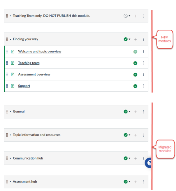
Figure 2 shows how your topic might look with the migrated content underneath the new modules.
 Figure 2
Move content into new modules.
The first two modules of the site are the new shell modules and they have been left largely empty during the migration unless it was obvious where your content needed to go. This is deliberate, because as TC you know best where your content should be placed in the new structure and what can be safely deleted.
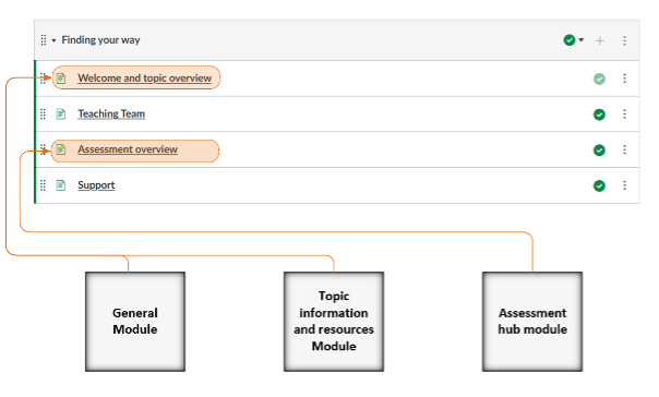
This will mostly entail moving your existing content from the old modules into the new Finding your way module. Illustrated in Figure 3.
The rest of your content can be structured in a way that best suits your topic structure, bearing in mind the weekly module structure from figure 1.
 Figure 3
- Welcome and topic overview page
This is the home page, and it is where you should add your welcome and the overview, aims and learning outcomes for your topic. You can move these from the General module and the Topic information and resources module, or wherever else they were put in your topic previously. You can also move any other important information from these two modules into this page. - Teaching Team page
Add your teaching team details here. - Assessment overview page
This page already contains important assessment related information, but you can move any other important information from the Assessment hub module into this page. The assessments themselves should not be on this page. - Support page
Anything on your site directly relating to student support, that is not covered in the pre-populated content, can be added here.
Remove the redundant modules
If your site has been rolled over in Canvas, or migrated from Moodle, it will still contain the two modules from the old starter site, Topic information and resources and Assessment hub, it may also contain the Communication hub and the General module.
When you have moved necessary content from these modules you can delete any redundant information and remove the now empty modules.
- General module
Please relocate any important information to the Welcome and topic overview, or other relevant page, delete any redundant information and delete the module. - Topic information and resources
Please relocate any important information to the Welcome and topic overview, or other relevant page, delete any redundant information and delete the module. - Communication hub
Please delete. This module contained two components, a discussion forum and a feedback forum. All discussion forums are now grouped in the Discussion link in the topic navigation menu, and Canvas does not have an equivalent of the Moodle Feedback tool, so this module is now redundant. - Assessment hub
Please relocate any important information to the Assessment overview page, or other relevant area, delete any redundant information and then delete the empty module. All marked assignments and quizzes are now available from the Assignments link in the topic navigation menu, so they can be removed from the module.
Content (weekly) module structure
This module is only in brand new topics, but you should follow the structure if possible. This structure sandwiches your content pages between a module overview at the beginning and a summary page at the end. This helps to orient your students and provide context and narrative to the content.
When you click on the 'Edit' button on a page, you will see orange boxes in the Rich Content Editor. These contain instructions that explain how you can interact with different sections of the page, or what information you should add to specific parts of the page to improve the learning experience for your students. The orange boxes are locked, so you cannot edit or move them.
Please note that you can see the instructions in these boxes only when you are editing the page. They are not visible to your students or anyone else when you are not editing the page.
Why are the instructions useful to me?
Each box provides context and guidance for what details to include. For example, on the Welcome and topic overview page, the orange boxes provide advice about how to change the banner image, and what to include under each heading (Welcome, and Topic overview). It is up to you whether you follow the advice or choose a different approach to what you write. As with everything in the Canvas shell, you can also delete content that is not applicable to your students' learning experience.
What if I am uncertain about what to do?
If you have read this document and you are still uncertain, contact the Learning and Teaching Innovation team in your college for support.


